The decision for an organization to rebrand is never an easy one, so when Community Concern of WNY came to FIFTEEN with a desire for a new look and feel, we took their needs and expectations seriously. After all, we were entrusted with giving a 50-year-old health and human services nonprofit an entirely new identity.
We first started by extensively interviewing the client, stakeholders and publics Community Concern served, in order to get a 360-degree perspective about what the current brand meant to them. What were its strengths? What were some challenges? Would everyone embrace a rebrand, or was there a lot of equity in the current one?
Our takeaway was that while Community Concern fulfilled a definitive need and did it to high standards, the name itself was, well…a concern. Not only did “Community Concern” conjure negative connotations such as worry or anxiety, but it failed to effectively communicate the services the organization provided. The name was holding them back from defining themselves as a human services agency.
Along with a new name, we needed to create a new logo and tagline, and redesign Community Concern’s outdated website. We also needed to let the public know about the rebrand.
Over the next several months we researched, designed and presented options for the client, who ultimately chose Harmonia, which is derived from the ancient Greek goddess of harmony and unity. With Harmonia Collaborative Care’s vision of empowering individuals to be healthy and fulfilled, we thought (and they agreed) the name fit them well, as did the “Life. With Balance” tagline. We wanted the new brand to reflect what the agency is today, as well as what it wants to become in the future.

The logo itself uses a tailored version of geometric san-serif font and a symbol inspired by the Decanomial Square, which represents upward growth. It shows how different pieces work together to form the whole, which we interpreted as a reflection of the organization’s holistic approach to its clients.
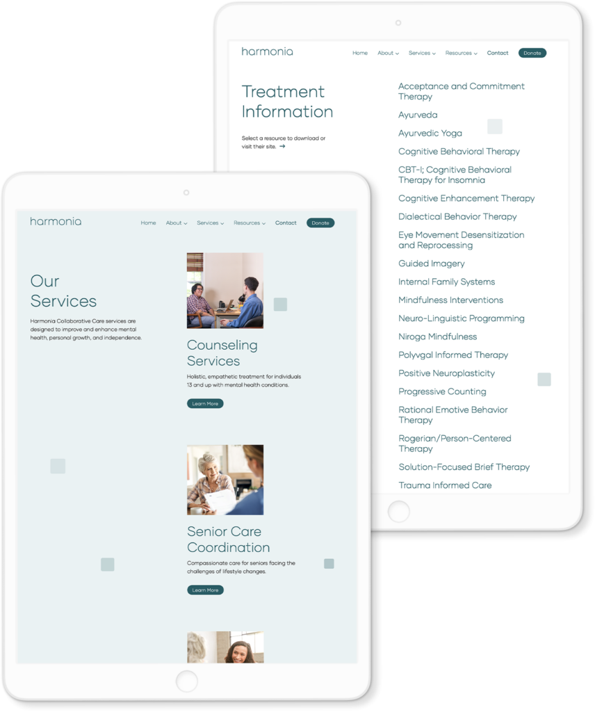
The redesigned website’s new address at www.harmonia-care.org incorporates updated information about Harmonia’s mission, programs and services, complete with new photography (including staff headshots), biographies, board information and community resources, all with a modern, more intuitive design.

Other components of the rebranding included new staff email addresses, and tangibles like business cards and letterhead (both hardcopy and electronic). We also constructed a brand guidelines document for Harmonia to use going forward. It outlines the font, colors and spacing of the new logo, and even provides examples of proper and improper usage, to ensure Harmonia’s branding is consistent among all verticals.
To round out our work on Harmonia’s rebrand, we incorporated a PR component, which included a news release outlining the rebrand and new website. Distribution coincided with the day Google recognized the new url, and working with Harmonia’s input, we cultivated a targeted media list of local and specialty media to receive the announcement. We also advised Harmonia leadership on communicating the news of the rebrand to its staff, board and clients, in order to ensure consistent messaging across its various marketing channels.
By all accounts, Harmonia’s rebranding was a success. The client is thrilled with its new identity, especially the thought and meaning we put into the name and logo. Through a carefully planned executed mar-com campaign, our various departments were able to work in tandem, thus ensuring a smooth rollout and positive response from Harmonia’s target audiences.


